Magnet Bikes
Client
Magnet Bikes is a Raleigh-based cycling shop dedicated to providing a diverse range of bikes and accessories for cycling enthusiasts and outdoor lovers. They offer a curated selection of products designed to enhance the cycling experience, from bikes to accessories and apparel.
Target Audience
Cycling enthusiasts and outdoor lovers seeking high-quality bikes and accessories.
Designer Decisions
For Magnet Bikes, I’ve designed a visually compelling and memorable logo that encapsulates the brand’s unique name and identity. The logo features an original illustration where the two tires of the bicycle resemble two magnets attracting each other, symbolizing the magnetic attraction and connection between the brand and its customers, as well as the magnetic pull of cycling as a recreational activity. The color palette for the logo includes medium green and light green. Medium green symbolizes growth, harmony, and vitality, reflecting the brand’s commitment to providing high-quality and sustainable products that contribute to personal growth and well-being. Light green, on the other hand, represents renewal, freshness, and nature, resonating with the outdoor and adventurous spirit of cycling and the brand’s focus on eco-friendly and sustainable practices.
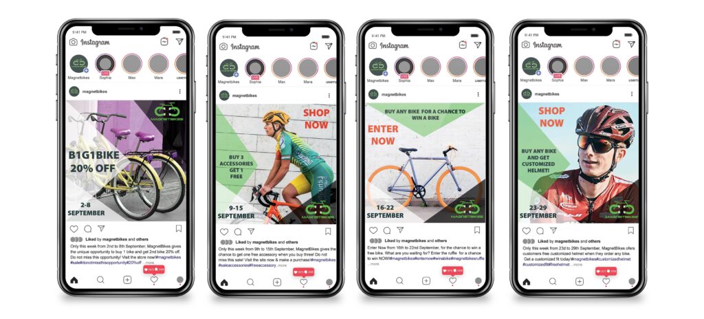
- Instagram posts
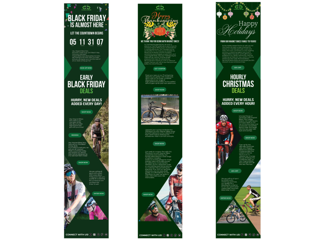
- Email Newsletters
- Logo Design
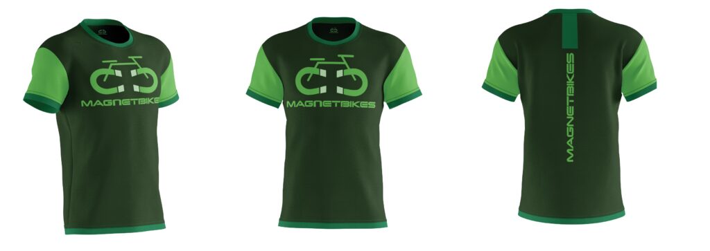
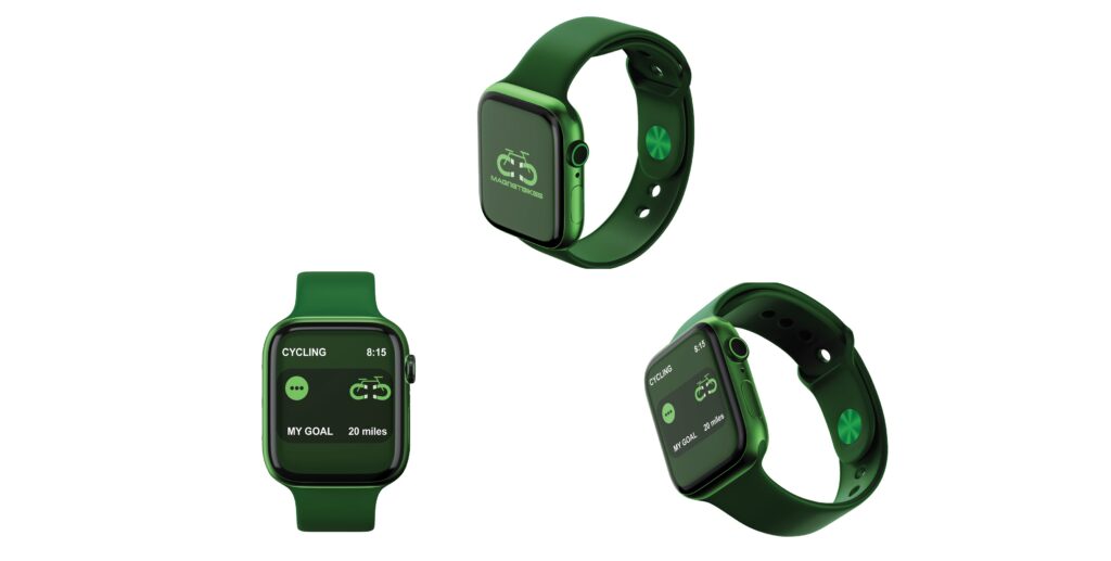
- Cycling Jersey & Watch Design
