CASE STUDY

THE CLIENT
Greenology is a leading company in the sustainable agriculture industry, specializing in locally sourced and grown produce. Their commitment to eco-friendly farming practices and community involvement sets them apart in the market. Greenology uses its annual report, “Growing Green Horizons,” to showcase its yearly growth to stockholders and to attract potential investors interested in sustainable and locally sourced food production.
THE PROBLEM
Greenology faced the challenge of needing an impactful annual report that could effectively showcase their yearly growth while also communicating their commitment to sustainability, community, and quality produce. As a company specializing in sustainable and locally sourced agriculture, Greenology needed a way to differentiate themselves in a competitive market and demonstrate their unique value proposition to stockholders and potential investors. It was crucial to solve this problem because the annual report serves as a vital communication tool for Greenology. It not only engages current stockholders but also attracts new investors who are interested in sustainable and locally sourced food production. A well-designed and informative annual report would reinforce Greenology’s brand values and mission, helping to build trust and credibility with stakeholders and investors. With the rise in demand for sustainable and locally sourced food products, Greenology faced increasing competition in the market. Their annual report needed to reflect not only their growth trajectory but also their sustainable farming practices, community involvement, and commitment to quality produce. Moreover, the annual report, titled “Growing Green Horizons,” was intended to align with Greenology’s branding and messaging guidelines, emphasizing their dedication to eco-friendly farming practices and community engagement. The report needed to be visually compelling, informative, and accessible to both stockholders and potential investors, making it a multifaceted design and content challenge.
MY ROLE
I was hired to serve as an illustrator, designer, and content strategist for Greenology’s annual report, “Growing Green Horizons.” Specifically, my responsibilities included: Illustration: Creating custom illustrations that captured the essence of Greenology’s farms, produce, and community events to add a personal and authentic touch to the annual report. Design: Developing a clean and modern layout for the annual report, integrating the custom illustrations with vibrant images of Greenology’s farms and produce. The design prioritized readability and engagement, ensuring that the content was accessible and visually appealing to stockholders and potential investors. Content Strategy: Crafting engaging narratives and infographics that communicated Greenology’s mission, values, and growth metrics effectively. I conducted market research to understand industry trends, stockholder expectations, and investor preferences, informing the content strategy and ensuring alignment with Greenology’s brand and the “Growing Green Horizons” theme.
THE SOLUTION
The solution I designed for Greenology’s annual report, “Growing Green Horizons,” is a harmonious blend of captivating illustrations, modern design aesthetics, and compelling content strategy. Through custom illustrations, I brought to life the vibrant essence of Greenology’s farms and produce, adding an authentic touch to the report. The clean and engaging layout, complemented by vibrant images, ensures readability and visual appeal, captivating the attention of stockholders and potential investors alike. Additionally, the content strategy integrates engaging narratives and infographics that effectively communicate Greenology’s mission, values, and growth metrics, resonating with the target audience. This dual-format report, optimized for both print and digital distribution, offers broad accessibility and reinforces Greenology’s brand across multiple touchpoints.
WALK THROUGH MY DESIGN PROCESS
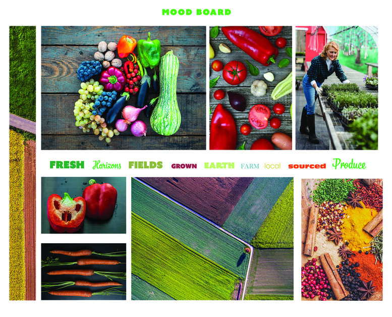
My design journey started with thorough market research to grasp industry trends, stockholder expectations, and investor preferences. This foundational step prompted the question: What are the key metrics and narratives that resonate with Greenology’s target audience? Following this, I crafted a mood board to visually conceptualize Greenology’s brand essence and the “Growing Green Horizons” theme. This served as a reference point as I transitioned to pencil sketches, outlining initial design concepts and visual layouts for the annual report. These sketches were then refined into detailed digital designs, integrating carefully chosen typography and color palettes that aligned with Greenology’s branding. Concurrently, I developed custom illustrations to vividly depict Greenology’s sustainable farming practices and growth milestones. Alongside these visuals, I drafted engaging content and storytelling elements, aiming to create an annual report that is not only visually appealing but also informative and memorable.
PENCIL SKETCHES
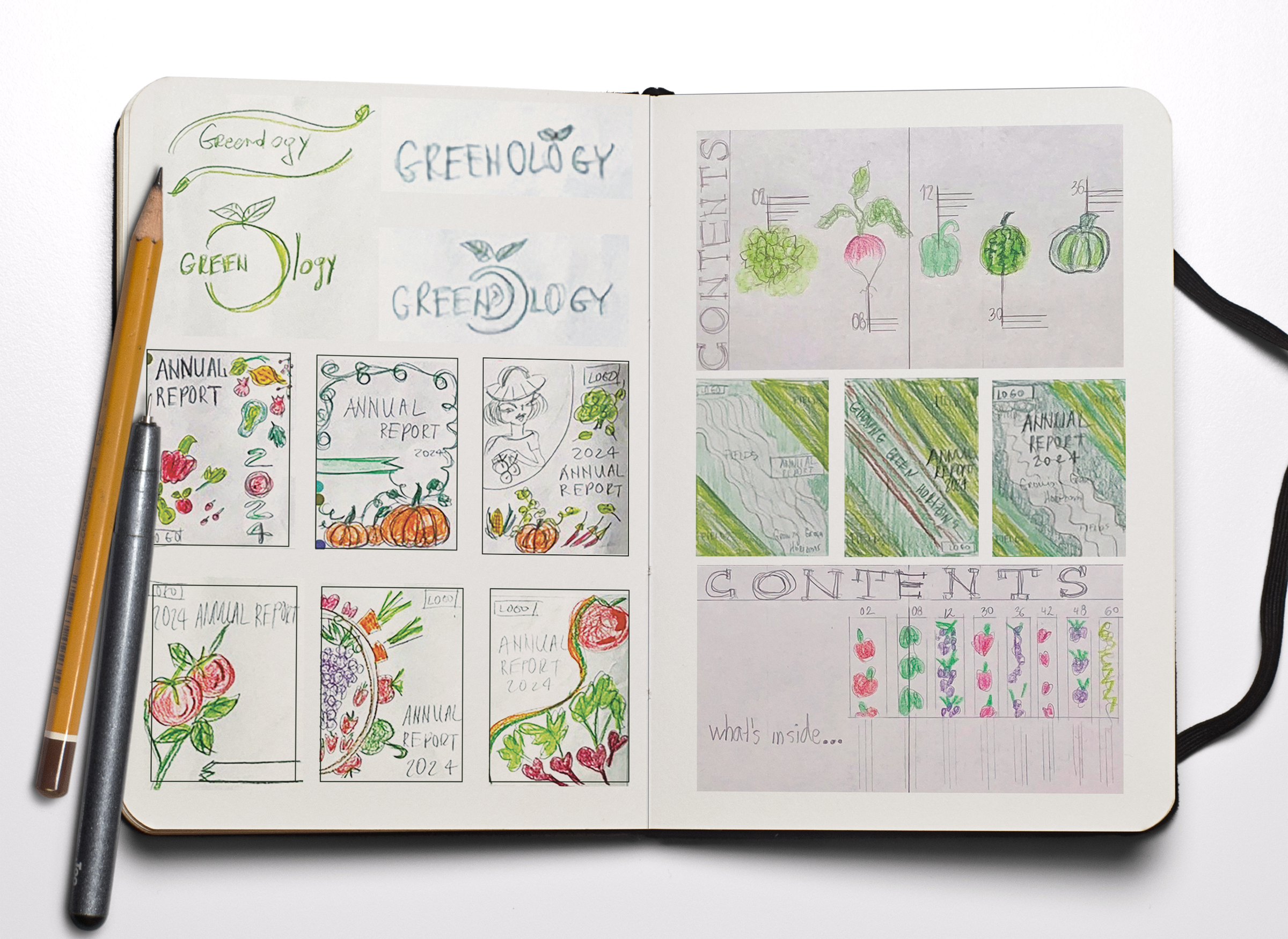
Pencil sketches play a crucial role in the design process as they serve as the initial conceptualization of ideas, layouts, and visual elements for the annual report. Here’s a deeper dive into how I approached the pencil sketch phase for Greenology’s “Growing Green Horizons” annual report:
Conceptualization:
Before diving into detailed sketches, I started with brainstorming sessions to generate ideas that would effectively communicate Greenology’s brand values, mission, and growth. This involved mapping out key themes and narratives that would resonate with the target audience, such as sustainability, community involvement, and quality produce.Layout Exploration:
With the conceptual ideas in mind, I began sketching out different layouts for the annual report. This involved experimenting with the arrangement of content, illustrations, and images to find the most engaging and visually appealing design. I explored various grid structures, page compositions, and flow of information to ensure a seamless reading experience for stockholders and potential investors.Illustration Thumbnails:
Concurrently, I created thumbnail sketches for the custom illustrations that would be featured in the annual report. These sketches helped me explore different visual styles, compositions, and perspectives to capture the essence of Greenology’s farms, produce, and community events authentically.
TYPOGRAPHY AND COLOR PALETTES EXPLORATION
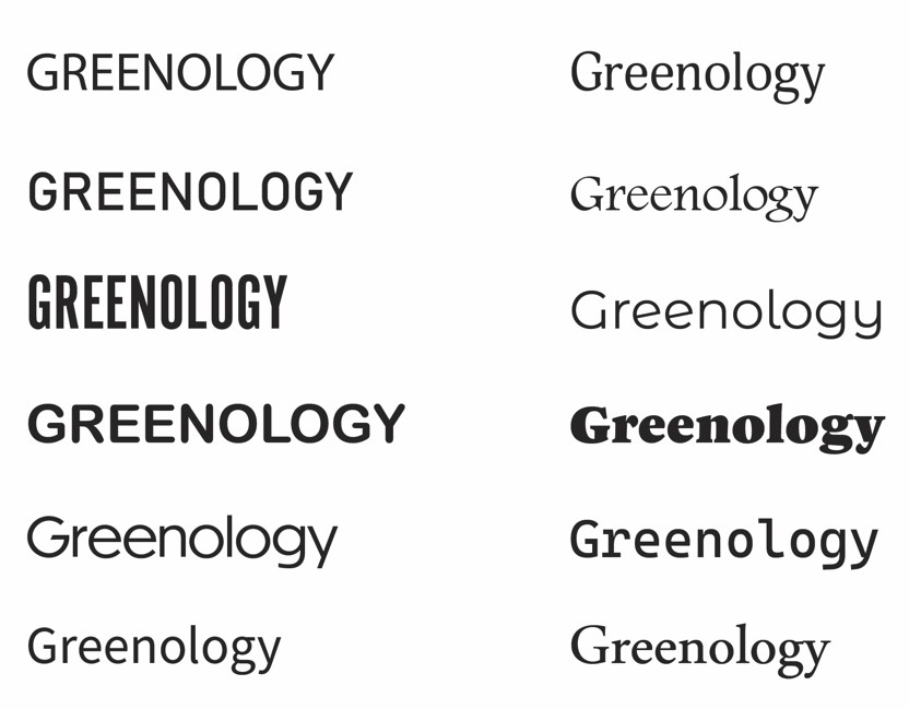
The exploration of typography and color palettes is a critical aspect of the design process, especially for a project like Greenology’s “Growing Green Horizons” annual report, where visual aesthetics play a significant role in conveying the brand’s values and messaging. Here’s a detailed look at how I approached this exploration:
Typography Exploration:
Font Selection:
I began by researching and selecting fonts that would align with Greenology’s brand identity and the overall theme of sustainability, community, and quality produce. I considered factors such as readability, versatility, and compatibility with both print and digital formats.Legibility and Accessibility:
Throughout the typography exploration, I prioritized legibility and accessibility to ensure that the content would be easily readable for stockholders and potential investors. I considered factors like line spacing, letter spacing, and contrast against background colors to optimize readability across various platforms and devices.
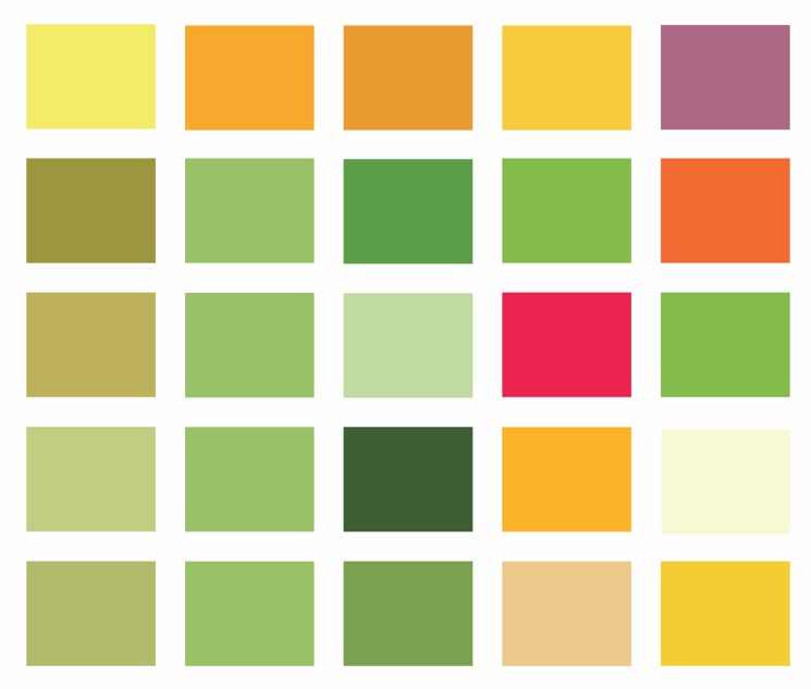
Color Palettes Exploration:
Color Research and Inspiration:
I conducted research to identify color palettes that would resonate with Greenology’s brand values and the “Growing Green Horizons” theme. I looked for inspiration in nature, agriculture, and sustainability to create a harmonious and cohesive color scheme.Color Psychology:
I considered the psychological impact of colors and their associations with concepts such as growth, freshness, sustainability, and community. This guided the selection of colors that would evoke the desired emotions and perceptions among the target audience.Color Harmony and Balance:
In the pencil sketches, I experimented with combining different colors to create a balanced and harmonious color palette for the annual report. I considered factors like color contrast, saturation, and tonal variations to ensure visual interest and readability across the design.Application and Consistency:
I applied the chosen color palette consistently throughout the annual report, integrating it into illustrations, backgrounds, text, and other design elements. This cohesive use of colors helped reinforce Greenology’s branding and create a unified visual experience for stockholders and potential investors.
DIGITAL DESIGNS & REVISIONS
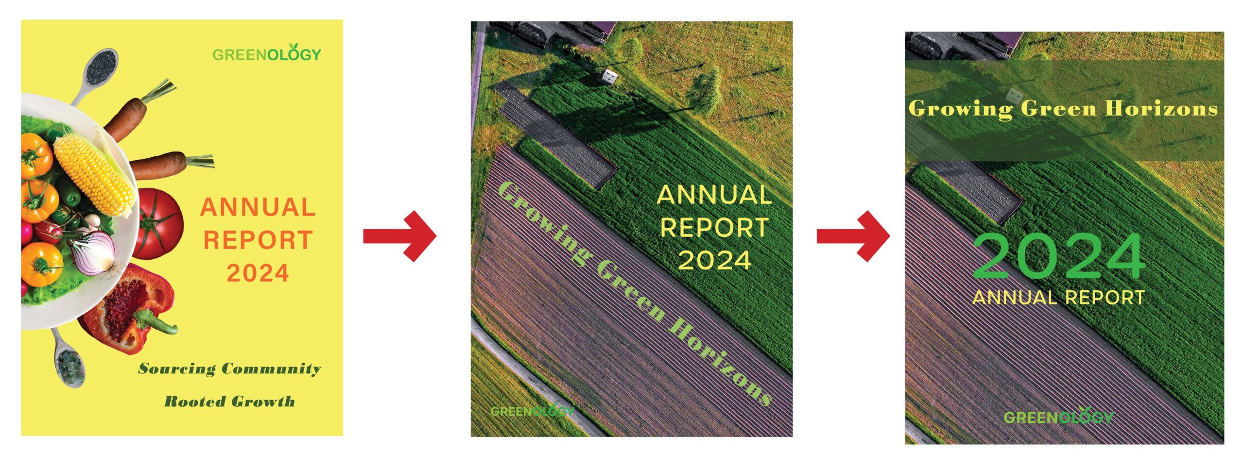
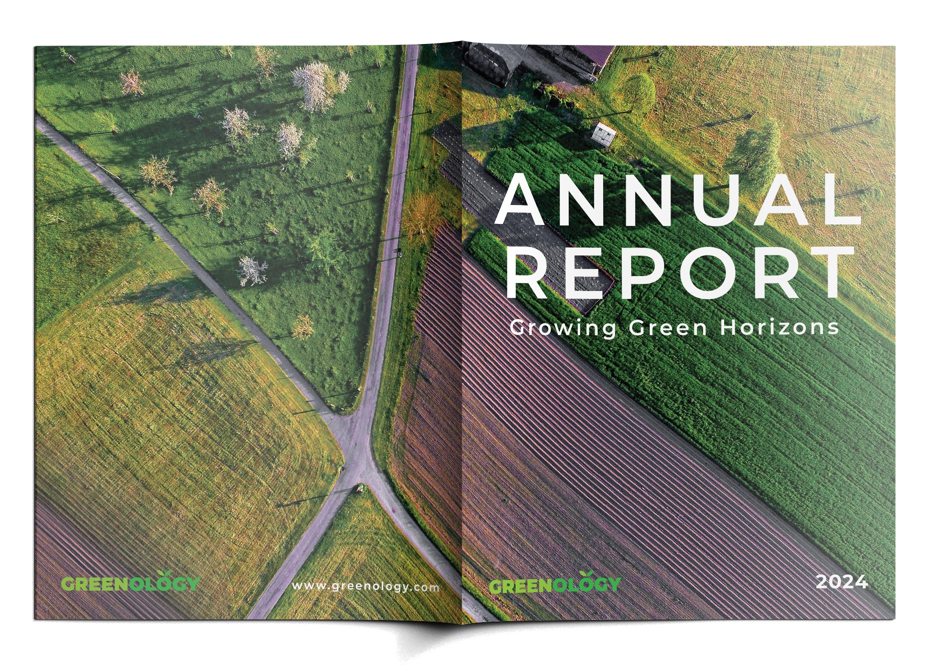
Cover Design Iterations:
- Started with a yellow background and fruit plate but changed to align with the sustainability theme.
- The second version had better theme alignment but needed typography adjustments.
- The third version used overlay and yellow text but didn’t solve the readability issue.
- Final design decision prioritized thematic alignment, readability, and visual appeal.
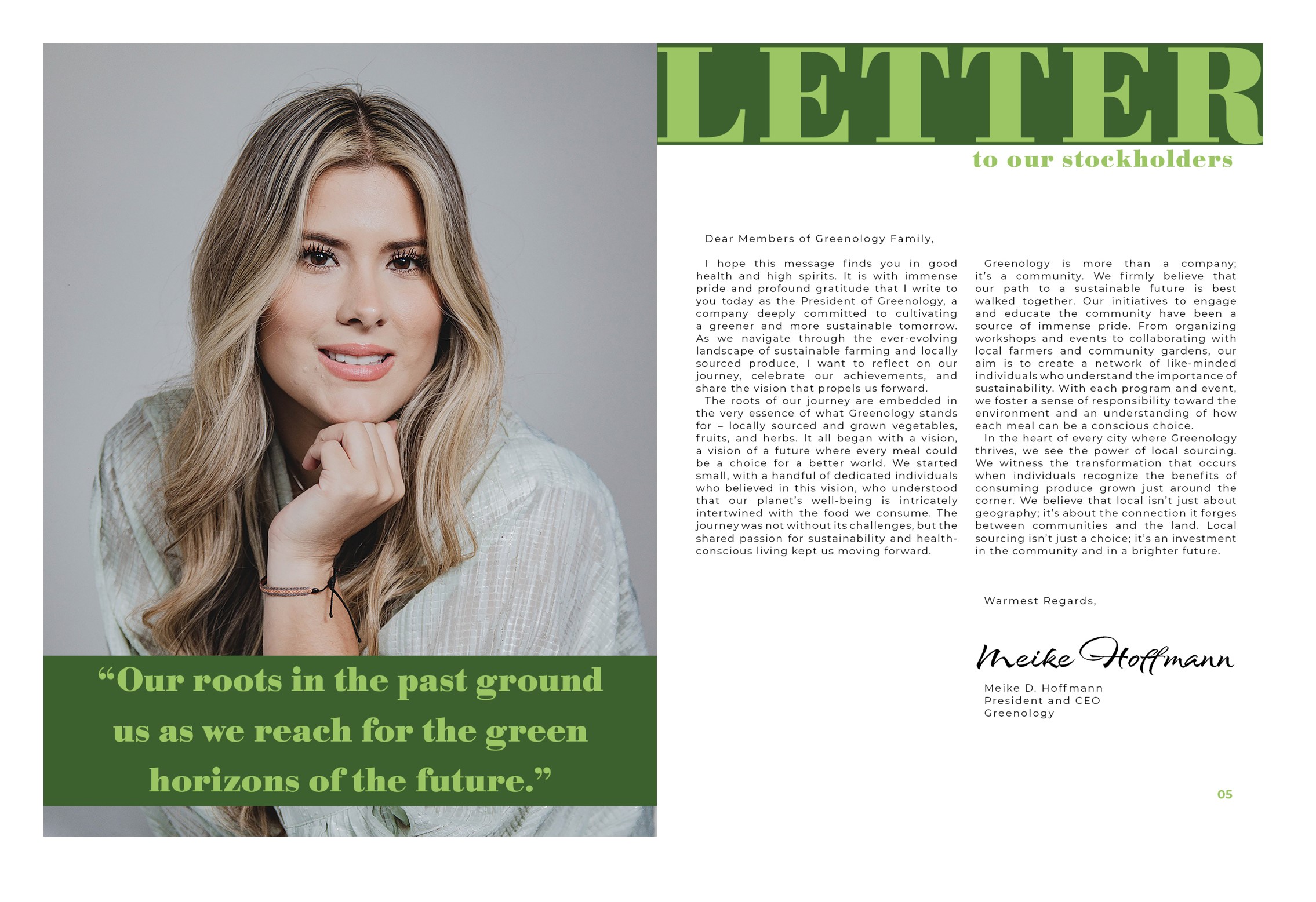
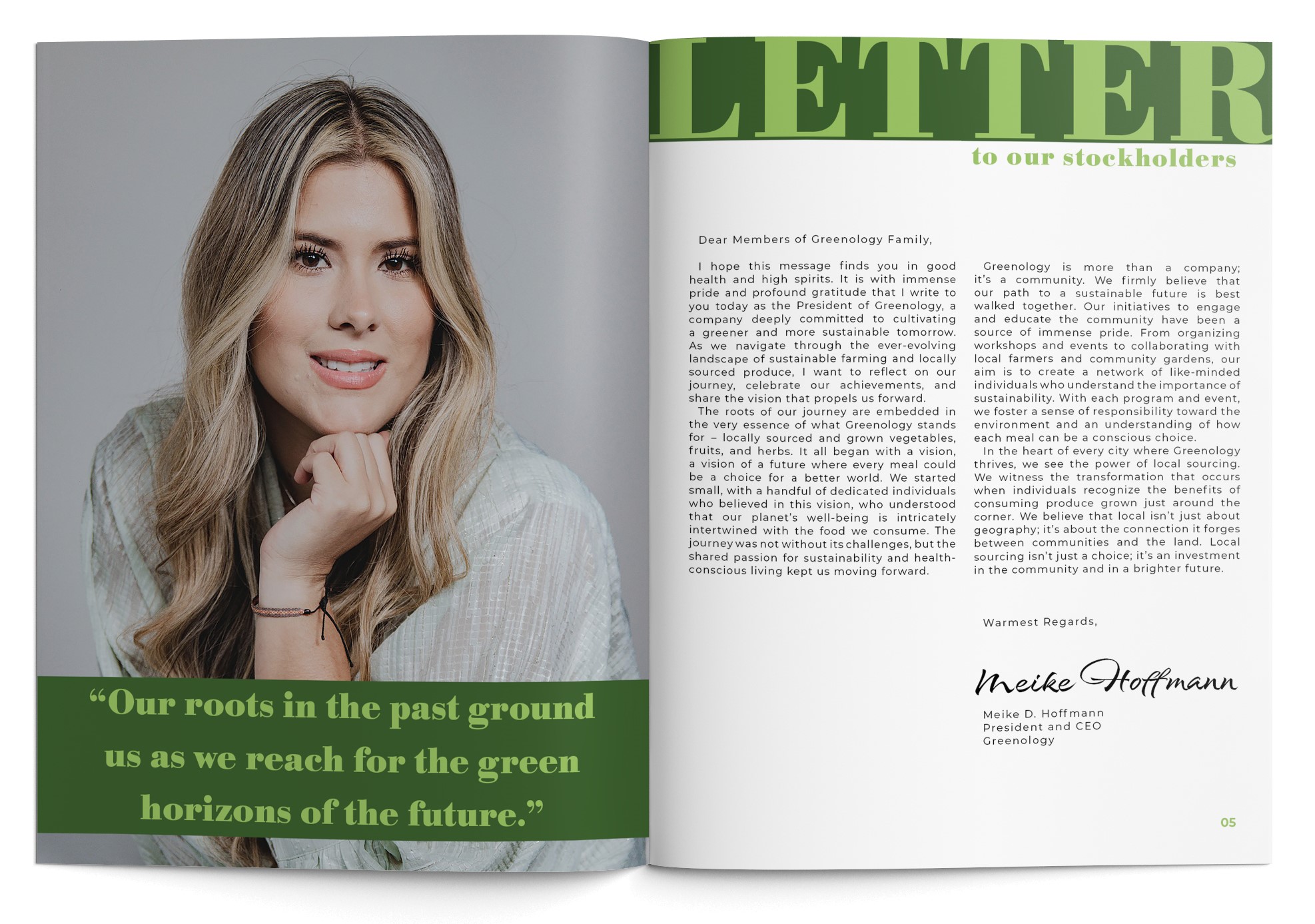
Letter to Our Stockholders Design:
- Initially used a yellow background with orange letters for vibrancy.
- Experimented with dark green and yellow but faced readability issues.
- Finalized with a green background and white letters for improved readability and theme alignment.
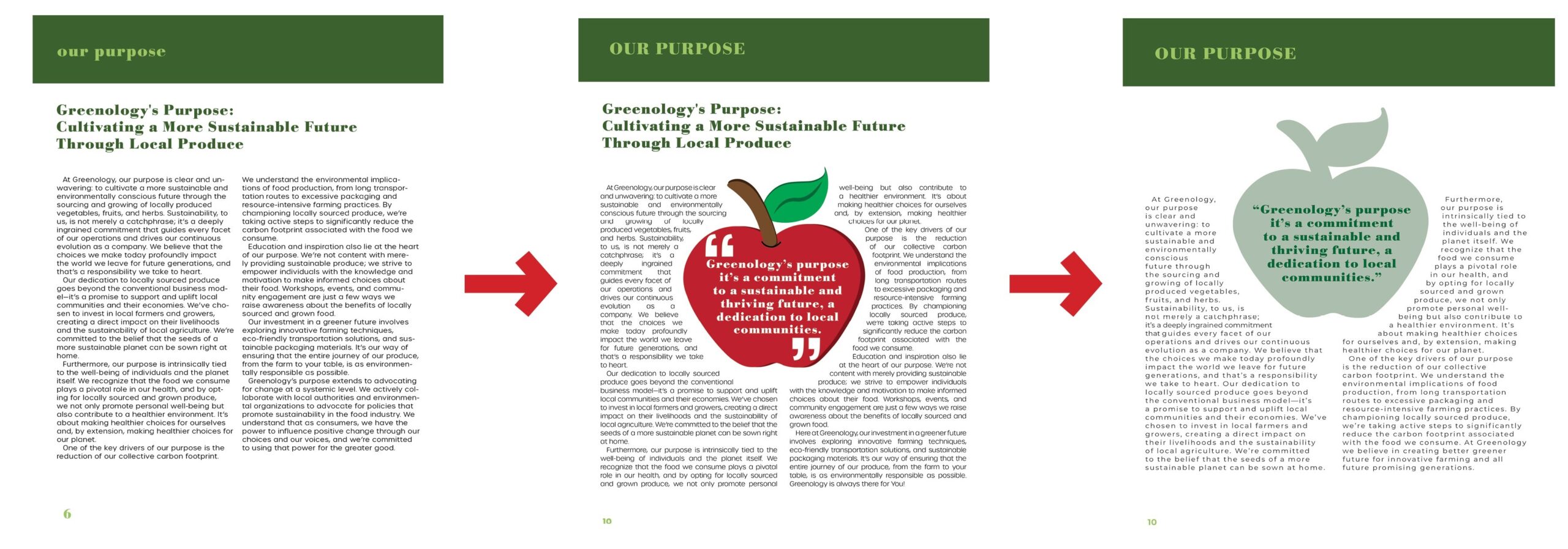
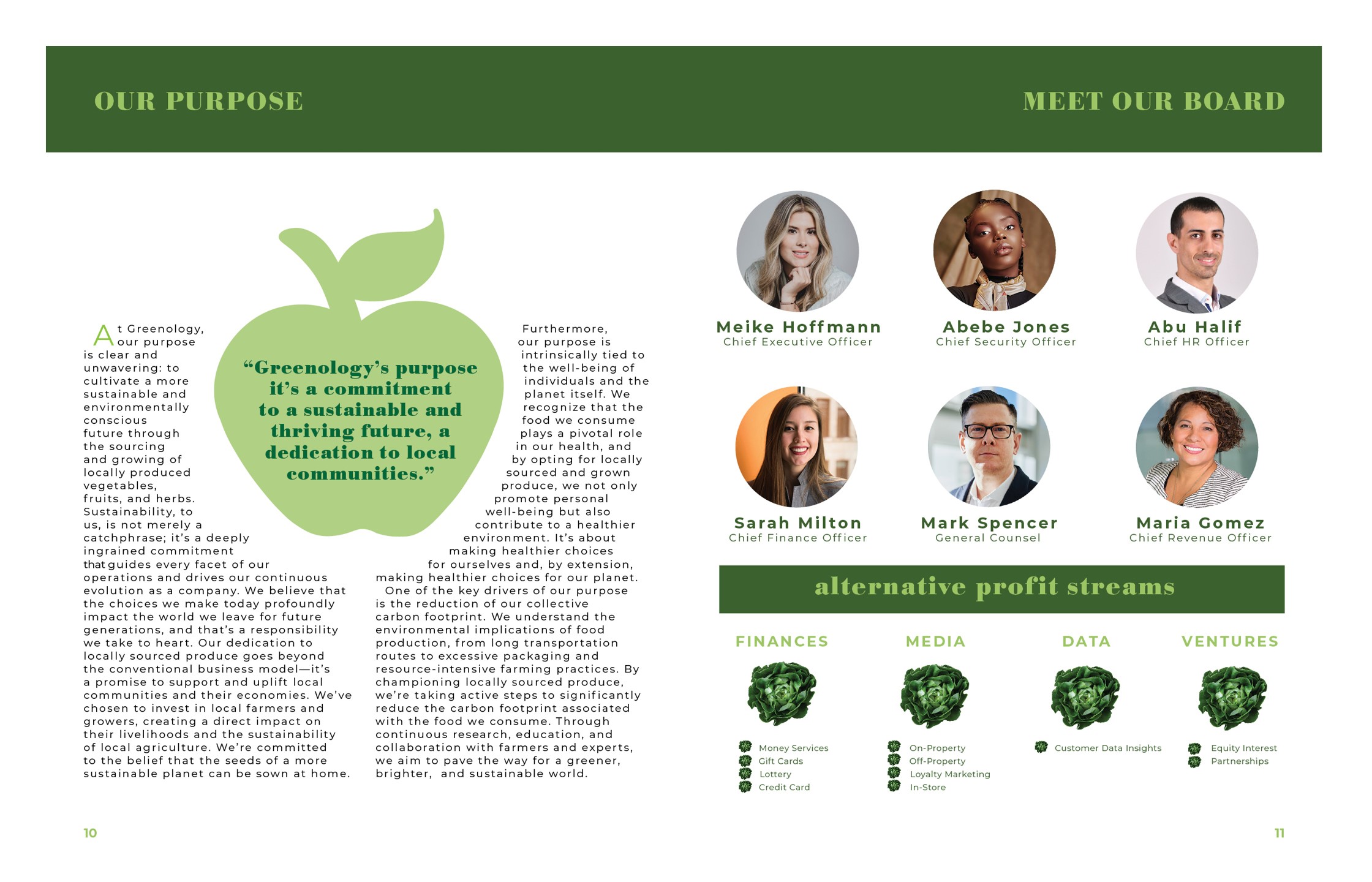
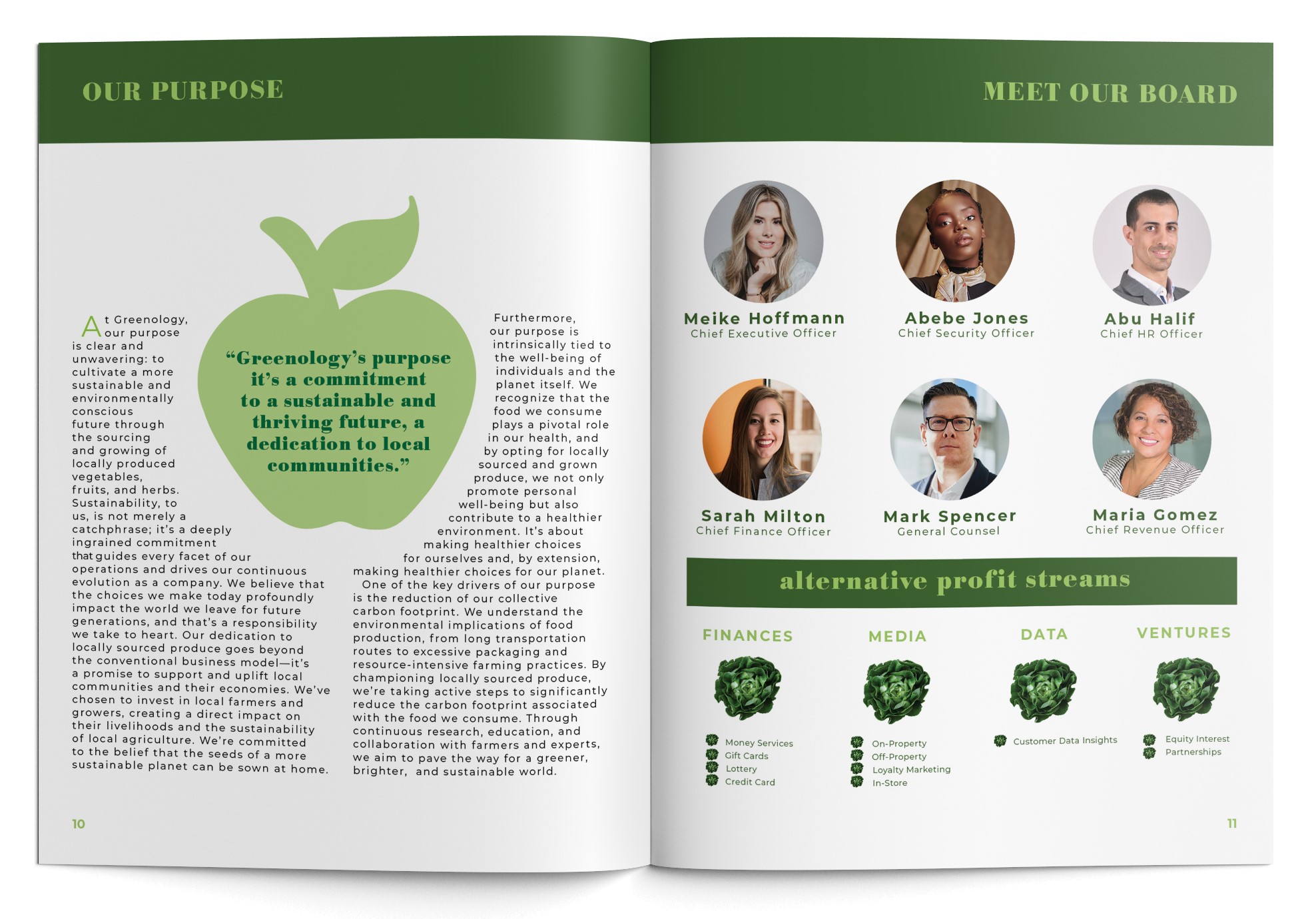
Our Purpose Page:
- Began with text-only content and introduced a red apple illustration.
- After revisions, changed the apple color to green to match the overall design and theme.
- Final version used a green resembling Granny Smith apples for thematic and design consistency.
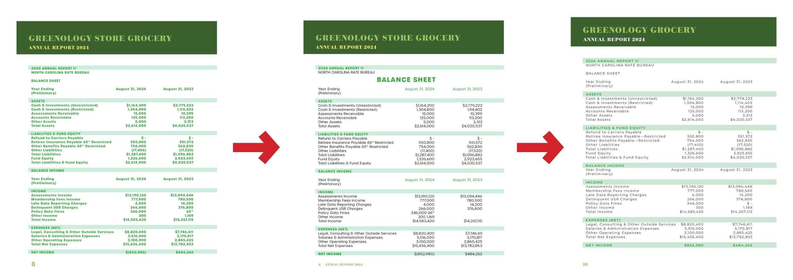
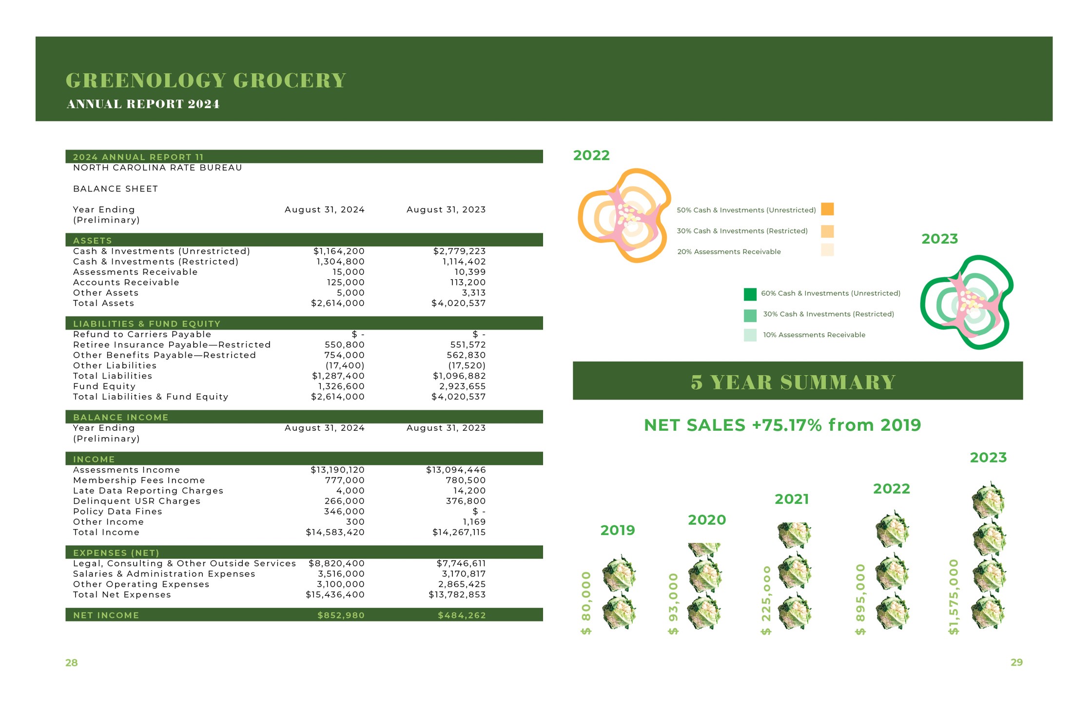
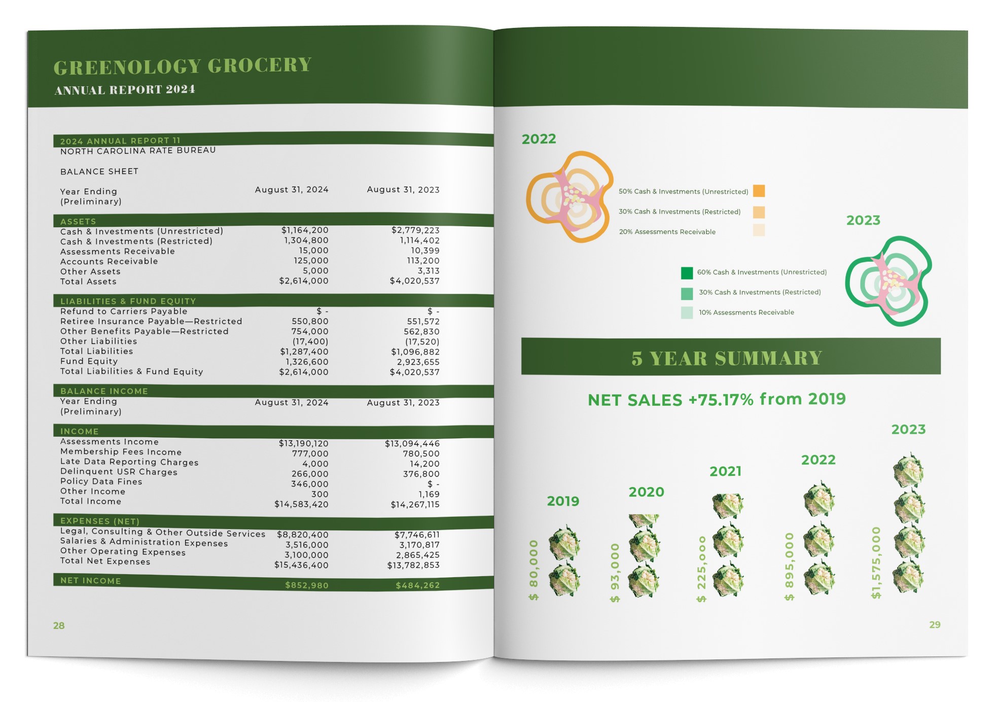
Balance Sheet Design:
- Started with all-green text for thematic consistency.
- Transitioned to black text with green design elements for enhanced readability and contrast.
- Final design used black text with dark green elements to balance readability, visual appeal, and thematic alignment.
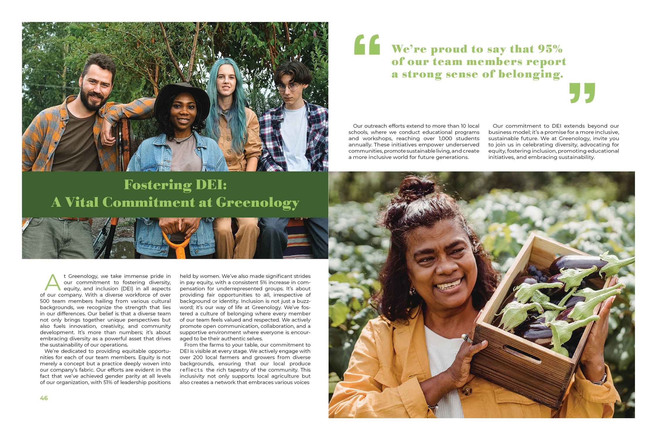
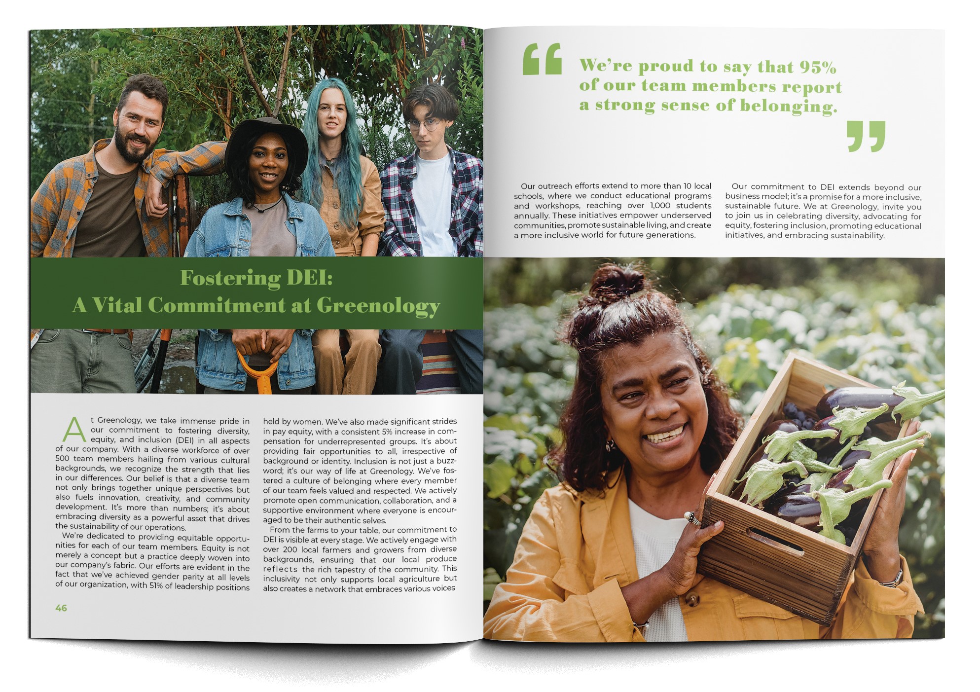
DEI Article Design:
- Incorporated changes in typography and image size to improve readability and visual balance.
- Final design adopted a 2-spread layout featuring two images and a quote, all in green color to maintain thematic consistency.


FINAL DESIGNS
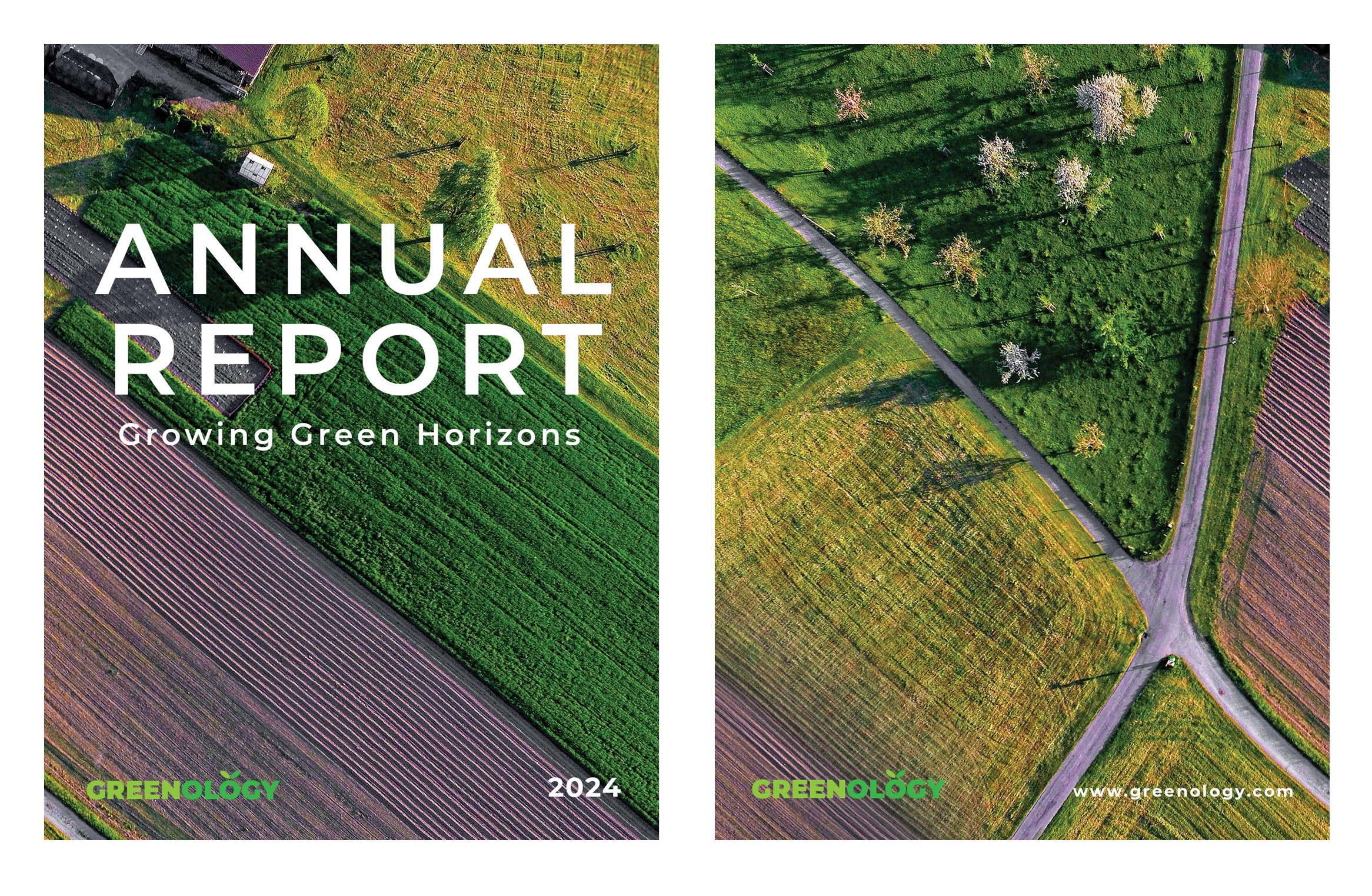
FINAL DELIVERABLES
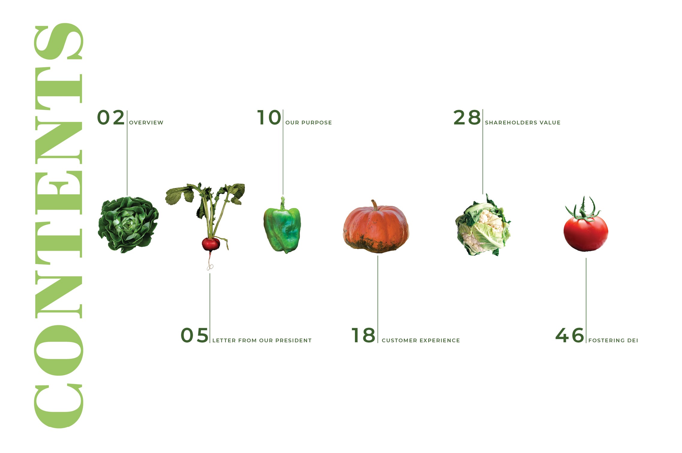
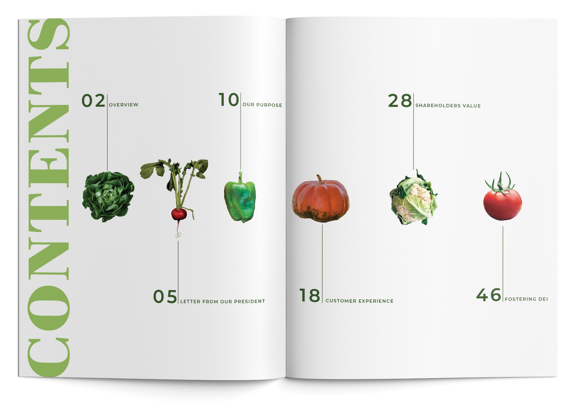
The final deliverable is an annual report featuring a cover and back page design, seamlessly integrating all designed elements into a cohesive and visually appealing document.
CONCLUSION
Throughout the design process of this project, I discovered the importance of aligning with Greenology’s brand and mission to create an impactful annual report. I began with comprehensive market research to understand industry trends, stockholder expectations, and investor preferences, guided by the key question: What are the key metrics and narratives resonating with Greenology’s target audience? This research informed the creation of a mood board, which visualized Greenology’s brand essence and the “Growing Green Horizons” theme. Subsequently, I developed initial pencil sketches and refined them into detailed digital designs, integrating chosen typography and color palettes that aligned with Greenology’s branding. The design phase also involved the development of custom illustrations depicting Greenology’s sustainable farming practices and growth milestones. Alongside these visuals, I crafted engaging content, including a letter from the President page and an infographics page, as part of the overall content strategy. Additionally, I created a DEI (Diversity, Equity, and Inclusion) article page to highlight Greenology’s commitment to these values. The culmination of this process resulted in the final deliverable: an annual report featuring a cover and back page design, seamlessly integrating all designed elements into a cohesive and visually appealing document.
